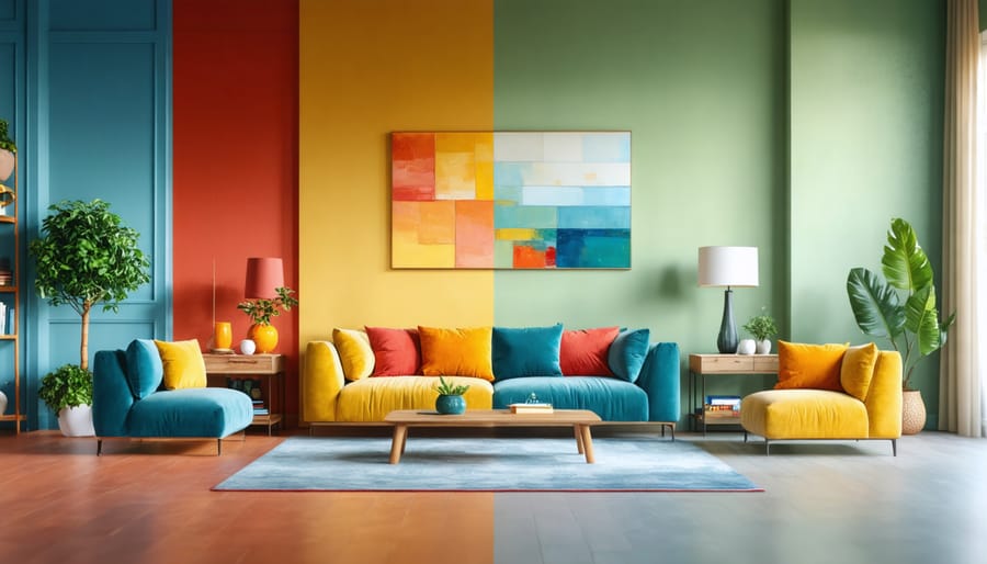
Transform your living environment with the strategic use of color psychology – a powerful tool that shapes emotions, influences behavior, and creates truly harmonious living spaces. Blue tones in bedrooms reduce anxiety and promote restful sleep, while energetic yellows in kitchens stimulate appetite and social interaction. Deep greens in home offices enhance focus and creativity, proving particularly effective for remote workers seeking productivity. Red accents in dining areas create warmth and excitement, perfect for entertaining spaces that demand dynamic energy. Understanding these color-emotion connections empowers homeowners to design spaces that not only look stunning but actively contribute to their daily well-being and lifestyle goals. Whether renovating a single room or planning a complete home transformation, the strategic application of color psychology principles delivers measurable improvements in mood, functionality, and overall living experience.
Your brain processes color through a fascinating interplay of neural pathways and psychological responses. When light enters your eyes, specialized cells called cones detect different wavelengths, translating them into electrical signals that travel to your brain’s visual cortex. This process happens almost instantly, triggering both physiological and emotional responses.
Different colors stimulate distinct areas of your brain, influencing everything from your heart rate to your stress levels. For example, seeing red can increase your blood pressure and energy levels, while blue tends to have a calming effect by releasing chemicals that promote relaxation. Green, being in the middle of the visible spectrum, requires minimal neural adjustment and is therefore the easiest color for your brain to process.
Your personal experiences and cultural background also play a crucial role in how your brain interprets colors. While some color responses are universal, others are learned through association. This explains why certain colors might evoke specific memories or feelings for you while triggering different reactions in others. Understanding these neural mechanisms can help you make more informed decisions about the colors you choose for your living and working spaces.
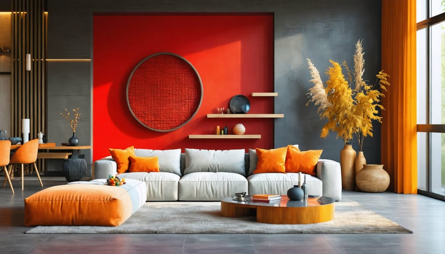
Red dining rooms create an energetic atmosphere that stimulates appetite and encourages social interaction. This powerful color choice has been successfully implemented in both residential homes and restaurants, where it promotes lively conversation and extends dining experiences. In social spaces like living rooms or entertainment areas, red accent walls or furnishings can create focal points that draw people together and inspire dynamic discussions.
Many successful restaurants utilize red in their color schemes through elements like booth upholstery, wall treatments, or decorative accessories. Homeowners often incorporate red through statement pieces such as curtains, artwork, or area rugs to achieve similar effects without overwhelming the space. When balanced with neutral tones, red creates an inviting environment that maintains its warmth while avoiding overstimulation.
The key to successful red integration lies in strategic placement and thoughtful dosage. Consider using red in areas where you want to encourage movement, conversation, and social engagement rather than relaxation or contemplation.
Orange and yellow tones can transform ordinary spaces into vibrant hubs of creativity and positivity. In kitchens, warm orange hues stimulate appetite and encourage social interaction, making meal preparation and family gatherings more engaging. Yellow, particularly in playrooms, promotes learning and mental agility while boosting children’s confidence and enthusiasm.
Creative professionals often incorporate these energetic colors in their workspaces to enhance innovation and problem-solving abilities. Design studios and art rooms benefit from orange accent walls or yellow furniture pieces, which help maintain high energy levels throughout the day. However, it’s essential to balance these bold colors with neutral tones to prevent overstimulation.
For optimal results, consider using these colors in morning-facing rooms where natural light can enhance their warming effects. Textured elements like orange backsplashes or yellow throw pillows can add depth while maintaining the space’s creative atmosphere.
Blue’s calming properties make it an ideal choice for bedrooms and bathrooms where relaxation is paramount. In master bedrooms, soft powder blue walls create a tranquil sanctuary that promotes better sleep quality and reduces stress. Coastal-inspired bathrooms featuring azure tiles or marine blue accents evoke the serenity of ocean waves, transforming daily routines into spa-like experiences. Light blue ceiling paint can make rooms feel more spacious and airy, while deeper navy tones add sophistication to accent walls or cabinetry. When paired with white fixtures and natural materials, blue creates a balanced atmosphere that combines cleanliness with comfort. Many homeowners report feeling more at ease and organized in blue spaces, making it particularly effective in master bath suites where morning routines set the tone for the day.
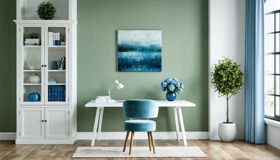
Green, as a bridge between nature and our indoor spaces, creates a perfect balance in home offices and living rooms. By incorporating natural elements in design, green walls or accents can significantly reduce eye strain during long work hours while promoting creativity and focus. In living rooms, sage and forest green tones create a welcoming atmosphere that encourages relaxation and social connection. Studies show that spaces featuring green elements can lower stress levels by up to 15%, making it an excellent choice for areas where you spend considerable time. Consider adding green through indoor plants, wall colors, or furniture pieces to create a harmonious environment that supports both productivity and relaxation.
Neutral colors form the backbone of any well-designed space, providing balance and versatility that allows other design elements to shine. White, often associated with cleanliness and purity, creates an open, airy feeling that makes rooms appear larger and more welcoming. It serves as the perfect canvas for showcasing artwork, furniture, and architectural details.
Black anchors a space with sophistication and drama, adding depth and creating striking contrasts when used thoughtfully. Whether through statement pieces or subtle accents, black brings a sense of elegance and definition to any room. When paired with white, it creates a timeless combination that never goes out of style.
The implementation of sophisticated grey tones offers incredible flexibility in design schemes. Grey acts as a bridge between stark contrasts, softening the visual impact while maintaining a professional and modern aesthetic. From light pewter to deep charcoal, each shade brings its own character to the space.
Brown tones introduce warmth and natural elements to your interior. From rich mahogany to light beige, brown connects us to nature and creates a sense of stability and comfort. When combined with other neutrals, brown adds depth and texture, making spaces feel more grounded and inviting. These earth tones work particularly well in living areas and studies where a calm, focused atmosphere is desired.
Successful color combinations in interior design create harmony while serving specific purposes in each room. In living rooms, the combination of sage green and warm beige promotes relaxation and social connection, making it perfect for family gatherings. Deep blues paired with soft grays work exceptionally well in home offices, enhancing focus and productivity while maintaining a professional atmosphere.
For bedrooms, lavender and cream create a serene sanctuary, promoting restful sleep and stress reduction. Kitchen spaces benefit from energizing combinations like sunny yellow and white, stimulating appetite and social interaction while maintaining a clean, fresh appearance. Those seeking more bold color combinations might consider pairing emerald green with gold accents in dining rooms, creating an atmosphere of luxury and warmth.
Bathrooms excel with spa-like color schemes such as aqua blue and white, promoting cleanliness and tranquility. For children’s rooms, combine soft coral with light green to encourage creativity while maintaining a calming environment. Entry halls make strong first impressions with sophisticated pairings of charcoal gray and cream, setting a welcoming yet elegant tone for your entire home.
Remember to consider natural light exposure when selecting color combinations, as lighting can significantly impact how colors appear and interact throughout the day. Test your chosen combinations in small areas before committing to entire rooms.
Color psychology is a powerful tool that can transform any space into an environment that supports your goals and enhances well-being. By understanding how different colors affect mood and behavior, you can make informed choices for your home or business interior. Remember that warm colors like red and orange can energize spaces, while cool tones like blue and green promote relaxation and focus. Consider the purpose of each room and the emotions you want to evoke when selecting your color palette. Start small by incorporating accent pieces or testing paint samples before making major changes. Whether you’re designing a productive home office, a calming bedroom, or an inviting retail space, thoughtful color choices can help create the perfect atmosphere. Take these principles and experiment with confidence – your perfect color story awaits.